
Print Guidelines


Logo Usage
DO NOT use PCC or any shortened version or variation (ie. PointClick or Point Click Care) of PointClickCare.
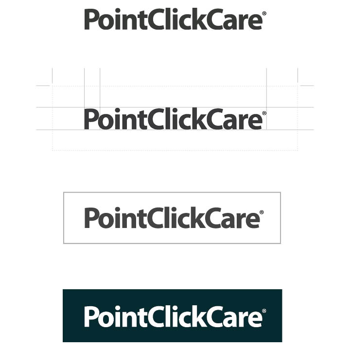
Corporate Wordmark
Acceptable Logo Usage
Maintaining the integrity of our wordmark is paramount to defining and protecting our point of view. To ensure consistency, it is important that the logo be used appropriately. In all instances, ensure you always use the full company name without abbreviations or incorrect spacing.
In order to maintain the visual integrity of our logo, always be sure to include space around it. A minimum equivalent to the height of the ‘P’ should be observed on top and bottom of the logo and by doubling the width of the ‘P’ to the left and right of the logo. Also, take care that the logo is always scaled proportionally. To make sure our logo remains legible at smaller sizes, the full wordmark should only be scaled down to 1.25-inch wide.
When using the logo on its own or in combination with other logos, a surrounding clearance area of .25” is required.
When the logo is applied against a colored background, use either the white or gray versions of the logo to ensure appropriate contrast for legibility.
What Not to Do
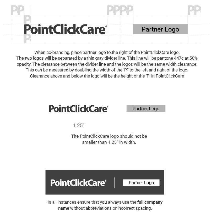
Logo Usage – Co-branding
Acceptable Logo Usage
In all instances, ensure you always use the full company name without abbreviations or incorrect spacing.
When co-branding, place partner logo to the right of the PointClickCare logo. The two logos will be separated by a thin gray divider line. This line will be pantone 447c at 50% opacity. The clearance between the divider line and the logos will be the same width clearance. This can be measured by doubling the width of the ‘P’ to the left and right of the logo. Clearance above and below the logo will be the height of the ‘P’ in PointClickCare.
The lowercase letters of the partner logo will be the same height as PointClickCare’s lowercase letters. Ensure that both logos have equal presence.
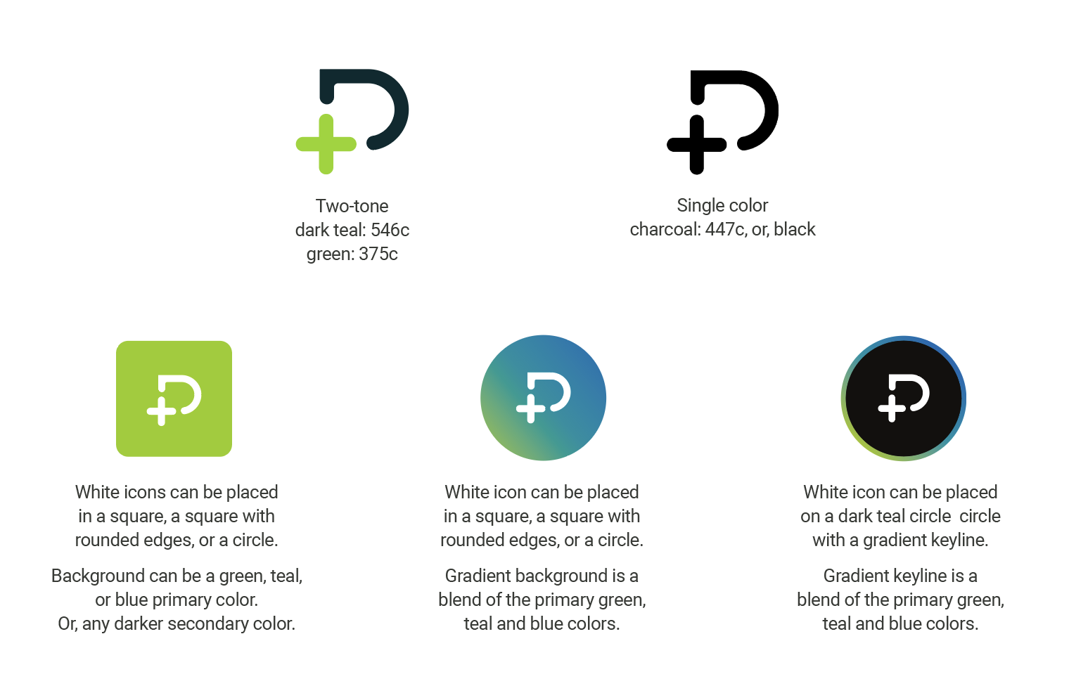
Corporate Monogram
The primary use of the PointClickCare monogram is on any company mobile applications, social media platforms, event demo stations, and swag materials where there is not enough real estate for the full logo (wordmark).
When applying the monogram, use the following color pairings for the most clearcut experience:
What Not to Do

Color Palette
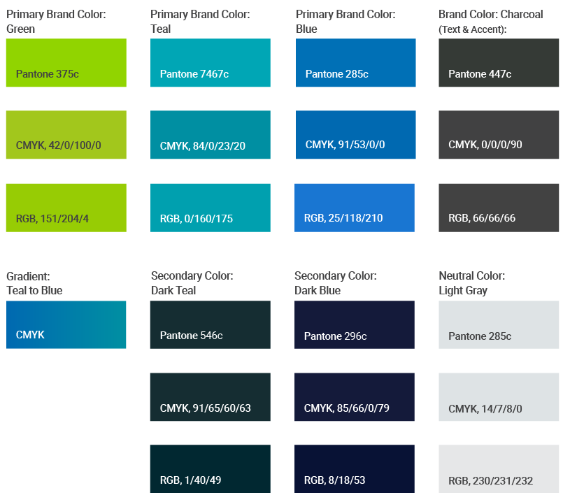
Print Palette
Our print color palette incorporates the primary colors from acquired brands, demonstrating a unified PointClickCare family.
For print assets ALWAYS use CMYK values. Text should ALWAYS be 90% black
Secondary colors dark teal, dark blue, and light gray can be used as accents.
RGB color values have been provided for use in Microsoft Office programs such as Word, PowerPoint and Excel.
To adhere to our accessibility AA level standards or print, we recommend the following:
- Font color should ALWAYS be white on blue and teal and the darker secondary backgrounds
- Font color should ALWAYS be 90% black on primary green background
- If adding text on a gradient background, we recommend using a gradient of teal to blue only Brand
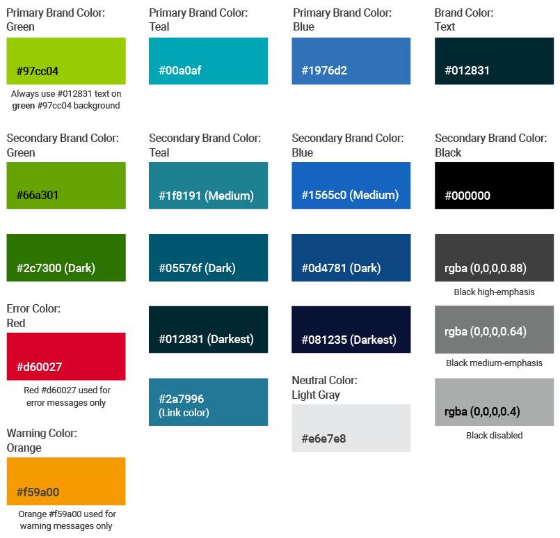
Web Color Palette
Our web color palette incorporates the primary colors from acquired brands, demonstrating a unified PointClickCare family. ALWAYS use HEX values. Any one of the primary colors can be used for your background.
To adhere to accessibility AA level standards for all web assets we recommend abiding by the following:
- NEVER use white text on primary green #97cc04 or secondary green #66a301 backgrounds
- ALWAYS use #012831 text on white, green #97cc04, green #66a301, light gray #e6e7e8, and rgba (0,0,0,0.4) backgrounds
- ALWAYS use white on primary teal, primary blue and darker secondary color backgrounds
- NEVER use gradients for web pages
NOTE:
Both red and oranges should be used sparingly and ONLY ON our web pages, product interfaces, and learning modules to highlight a specific area, as illustrated.
Red #d60027 should always be used for error messages.
Orange #f59a00 should always be used for warning messages.
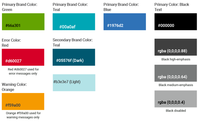
Product UI/UX Color Palette
Our product interface color palette incorporates the primary colors from acquired brands, demonstrating a unified PointClickCare family.
ALWAYS use HEX values. Any one of the primary colors can be used for your background.
To adhere to accessibility AA level standards for all web assets we recommend abiding by the following:
- NEVER use white text on primary green #66a301 background
- ALWAYS use #000000 text on green #66a301, #b3e3e7 (light) and rgba (0,0,0,0.4) backgrounds
- DO NOT use white text on #66a301 background
- ALWAYS use only black or white text on primary teal, primary blue and darker secondary color backgrounds
NOTE:
Both red and oranges should be used sparingly and ONLY ON our web pages, product interfaces and learning modules to highlight a specific area, as illustrated.
Red #d60027 should always be used for error messages.
Orange #f59a00 should always be used for warning messages.
Call to Action (CTA)
Our updated CTA buttons feature rounded edges. The text within should be action-oriented to construct a sense of urgency. However, keep length of text from two to no more than five words. Ensure text on CTA is legible. Text should be big enough to draw attention, but not so big that it completely overwhelms the rest of the content.
Contrasting colors work best to make striking buttons. Keep enough space around the CTA to allow for the button to stand out.
For digital purpose all the primary and secondary colors may be used for button colors to ensure significant contrast when on brand color backgrounds.
Buttons have different states in product UX. Contained style buttons are CTAs, outlined style are secondary buttons, and text style are tertiary buttons. Text within CTA button label should be in all caps for product user interface apps.

Fonts
Fonts
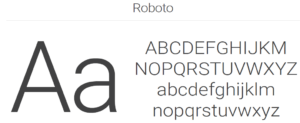
Our corporate font Roboto is from a geometric, sans serif font family that has a wide variety of weights and styles. The Roboto family of fonts is seen as modern, clean and approachable. This style of fonts are the most readable of all of the font groups, supporting accessibility across all our mediums.
- Use Roboto Light for headlines
- Use Roboto Regular for body copy
- Use Roboto Medium to highlight text
Body copy should always be 10 pt with a 14 pt leading. Overall text tracking is set to -25 unless otherwise specified.
Font color on solid teal, blue, dark teal or charcoal background should always be white. Font color on a white or solid green background should always be charcoal.
Color values are as follows:
- CMYK: 0/0/0/90 (90% black)
- RGB: 66/66/66
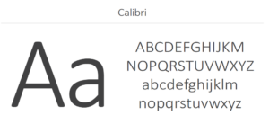
The Calibri-type family is our corporate Microsoft Office font.
- Calibri Light is headline font
- Calibri Regular is body copy font
Iconography
Iconography
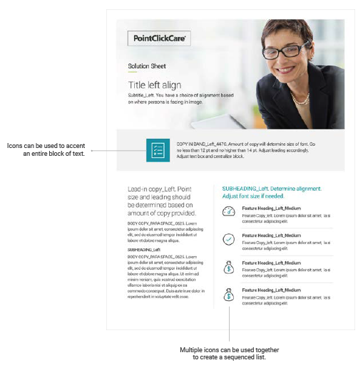
Functional iconography helps tell a quick story. Icons add clarity to brand messaging and texture to the visual explanations of our offerings or key findings.
Clean, simple, and evergreen, our Nucleo icon library allows for consistency across multiple media. Unique icons can be created, although they must align with the visual style of Nucleo. Though Nucleo has filled icon options, only the outlined option should be used to keep it simple. This allows for legibility at smaller sizes.
Examples are for illustrative purposes only. Icons can be showcased as follows:
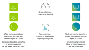

Icons Used Inside a Product
Filled icons should be the primary style used in all PointClickCare digital products.
The filled style is faster to recognize than outline style icons, the solid silhouette makes characteristic cues easier to identify.
For web and mobile applications, we use icons from the Nucleo and Google Material Design icon library, which have been defined in our Evergreen design system Figma design library.
If you still can’t find what you are looking for, you would work with the UX and brand marketing team to create a custom icon to best capture your use case.
Photography/Imagery
Our Images reflect the personality of our brand: confident and provider-centric in consideration of the focus on their patient. They are relatable to our customer base and are primarily used for large campaigns and event booths. Images are a mix of color, black and white, and monotone overlays using our brand colors.

In Situ Imagery

Tips and Tricks
Apply design-thinking when creating all assets
Use conversion centered design principles when creating any asset – not all will be applicable
Use photographs vs just illustration/icons. Recommended is a combination of both
Printed assets – create a white border to frame the artwork
Headline copy is grey (447c or 90% black) never in colour
Subhead copy can be a corporate colour but the font must be regular or medium weight for legibility